Redefined Organic Apparel
An organic apparel brand created for my Auburn Graphic Design Senior Capstone Project

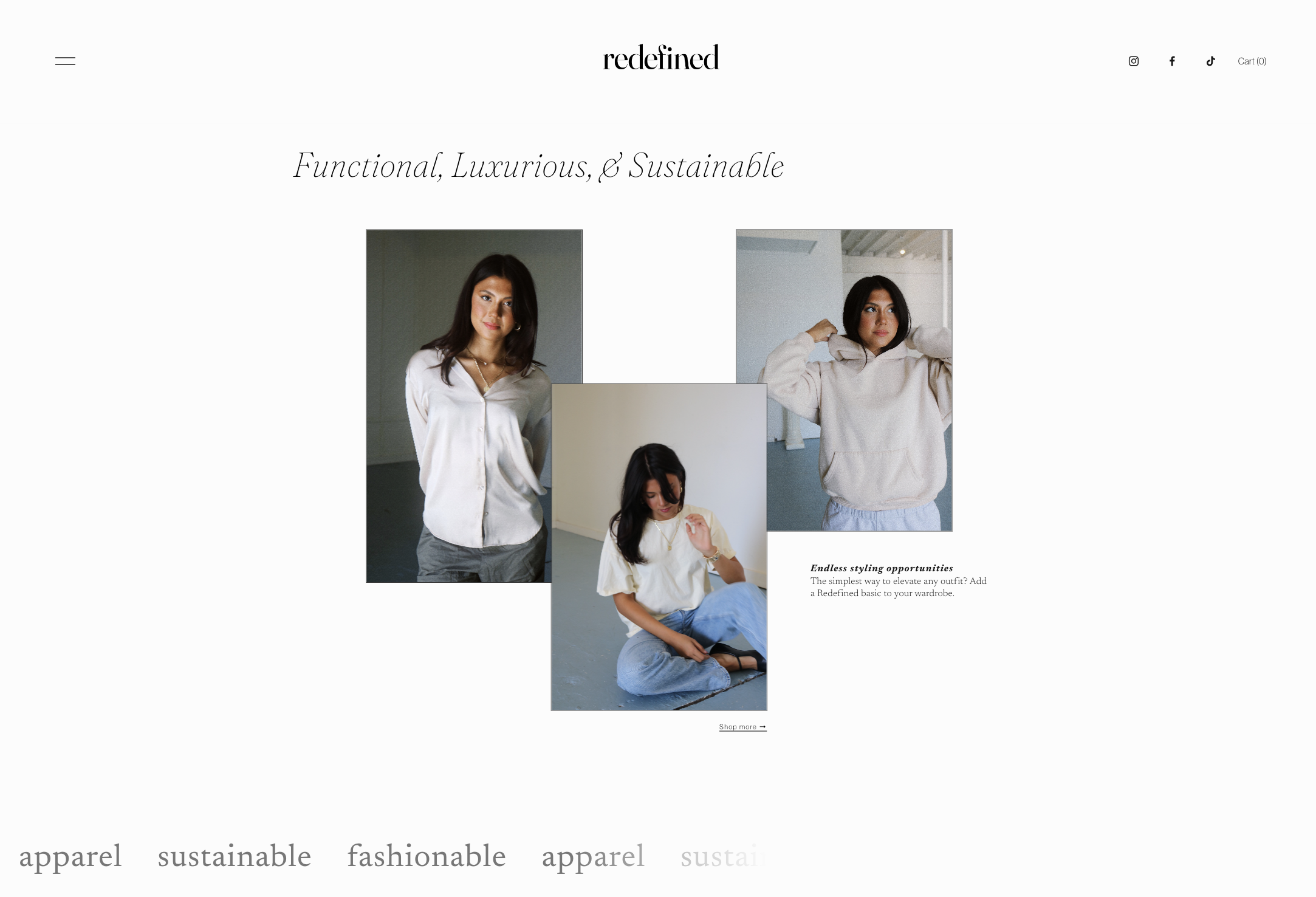
Desktop Web Home Page
An Elevated Approach to Sustainable Fashion
Redefined Organic Apparel is the project created as my final project to complete my B.F.A. in Graphic Design at Auburn University. The project, known as the Senior Project, is a one-semester-long project researched, designed, and completed in the Spring of 2024.
I created the conceptual brand, Redefined Organic Apparel, in response to the growing market for high-fashion, ethically sourced apparel. The structural components necessary to construct Redefined Organic Apparel—a small online and direct mail fashion brand–allow for a broad project scope that encapsulates my strengths as a graphic designer, web designer, and strategic social media designer.
Project Scope
Brand Identity (Concept Company)
Web Design
Mobile UX/UI
Photography
Publication: Sales Catalog Design
Packaging
Clothing Tags
Branded Collateral Print Design & Stationery
Blog & Social Media Content
Marketing Strategy Concept for the Brand Concept
Hover over images for more information.Model: Sophie Courson
Photography: Lora Maldonado

Key Words
FOUNDATIONAL | A BLANK SLATE | FRIENDLY | CHIC | CLASSIC | CANDID
Redefined is the foundational wardrobe made for luxury and organic buyers.
-
Project Deliverables
The Live Website with Shop Capabilities
Developed on Squarespace with Custom CSS additions
Optimized for Desktop, Tablet, and Mobile
Brand & Identity Design
Primary Logo, Secondary Logo, Typeface, Color Palette
Brand Key Words
Photo & Video in Mock Apparel
Photos Taken on Canon EOS Rebel T6i
video taken on iphone 15 pro max
• Disclaimer: The clothing used is not made for the brand. The items are used as an example of what Redefined Organic Apparel’s products would be. Clothing Sources: Amazon Organic Tees, Sweatpants from Pact, Sweatshirt and Blouse from Mate The Label, Jeans from Levis.
Print Collateral & Stationery to be included in customer boxes and sent as promotional direct mail
Clothing Tags and Order Box
Social Media (Instagram/Facebook): Stories, Posts, Video, & Feed Samples
Email Campaign Ads
Product-specific Information Cards and Magazine Sections
Written Brand Stories & Online Blog Posts to enhance brand messaging
24-Page Product & Photography Catalog
Half-Size Letter (5.5” x 8.5”)
Digital-Adapted Catalog & Photo Lookbook for Website
The Brand Motto:
Basic is not boring.
While Redefined’s pieces are simple, the creativity begins in their styling. The brand statement is “Basic is not boring.”
This statement is a consistent element throughout the brand’s messaging and is emphasized through photography, wardrobe styling, and creative details in the graphic design of print and digital media.
Research
Key Design Challenges
-
Brand Positioning
Redefined is positioned as the foundation for a fashionable wardrobe for both luxury fashion and organic buyers. The overlap of interests and canonically different aesthetics of luxury fashion and organic fashion presents an interesting dichotomy, presenting an intriguing challenge needed to blend the two aesthetics of both luxury and organic markets.
The clothing and accessories are classic cuts and void of patterns. The items are meant to be styled as creatively, or as simply, as the buyer's style.
-
Redefined Organic Apparel is a brand for women desiring the highest quality basics without synthetic fabrics and materials. This means high-quality, luxury-like craft that uses only organic materials in garment production and packaging.
-
In contrast to the traditional aesthetic of organic fashion brands, Redefined has an edge—a chic quality often reserved for runway fashion brands. Yet, the brand is also friendly through its communication, quirky logotype, and use of soft and organic materials in packaging.
Initial Project Research


Aesthetic Mood Board & Inspiration

Process Notes
Brand Identity & Typography
After researching current trends and competitors, I chose a type-driven approach for Redefined Organic Apparel’s brand identity. Starting with the smallest deliverable—the clothing tags—I worked upward to the website, which allowed for the most expressive type treatments.
To ensure seamless functionality across print and digital platforms, I selected Fraunces as the primary typeface. Its variable features enabled precise adjustments to width and curvature, adding flexibility to the design. For body copy and subtle details, I paired it with Newsreader, a refined and classic complement to Fraunces. Fraunces anchors the logos, headings, and display type, while Newsreader adds a polished touch to packaging and other supporting elements.
Deliverables


Brand positioning challenges are solved through design choices.
-
To achieve this goal, I selected the variable typeface Fraunces. The ligatures and funky characters of the typeface paired with casual, yet engaging, copywriting soften the brand's visual feel.
-
Redefined Organic Apparel uses:
organic cotton, linen, and silk fabrics for clothing and accessories;
sustainable vegan leather for denim patches;
recycled compostable cardboard boxes for shipping;
and recycled cotton paper for clothing tags and other print media.
For the sake of my student budget, I elected to use Neenah Environment Paper in Birch for print media and clothing sourced from the fabrics listed above to achieve Redefined’s overall aesthetic. The portion outside of budget was the box: the shown box design is only a concept and would be adjusted according to the ideal materials.
-
The combination of a high-fashion, classic aesthetic with the friendly type, copy, and natural materials used in product production and packaging position the brand for a broader audience than a traditional luxury fashion brand, inviting the eco-friendly audience to the luxury realm.
Brand Identity
Logo, Secondary Logo, & Typography

Primary Logo

Secondary Logo Emblem
This logo signifies Redefined’s use of organic materials or education about the brand’s sustainability efforts within the fashion industry.
Using the variable typeface Fraunces at different weights and softness balances a casual and refined aesthetic.
-
FRIENDLY
Organic curved shapes are achieved by using Fraunces as a smaller point scale (employing characters with more softness to their curves) and at different weights allowing for a more delicate type overall. It’s a place for the eyes to rest, inviting the viewer digitally or engaging the reader in print to delve into the story behind Redefined. This is a display of the true voice of the brand.
CHIC
In large scale and on the fashion lookbook page, Fraunces is used at a higher point scale, increasing the contrast of the letterforms—the serifs and crossbars are sharper, creating a sleek look. The striking quality of the letterforms is eye-catching and elegant, which is the appeal of the brand.
Photography & Video
Photo Backdrop Video on Seen Redefined Desktop Website
Model: Sophie Courson | PhotograpHY & Styling: Lora Maldonado 


Clothing Tags


Live responsive website developed in Squarespace with custom CSS

Mobile Website Video Walk-Through
Creating a seamless brand identity from print to digital–a problem solved by color choice.
-
Color Choice: A foundational brand needs foundational colors.
Embodying the concept of Redefined Organic Apparel as a foundational brand. I employed highlights of light yellow and blue to add more character to the digital site. The color choice is meant to be reminiscent of the foundational colors: primary blue and yellow.
The majority of the branding is presented in white, black, and gray tones to represent a blank canvas or palette for the buyer’s style.
The monochromatic lean of the brand identity reflects the conventional presentation of contemporary luxury and high-end fashion. So, the color choice helps catch the eye of those buyers too.
Desktop Website Screenshots


Mobile Website
Beginning Section Mobile Home Page
The Catalog
Full Catalog Slideshow


Inspired by the resurgence of classic brands like J.Crew, Gap, & Ralph Lauren, the catalog layout and photography takes inspiration for classic product catalog publication style: both candid and traditional images included.

Customer Connection
The written brand story is available for customers in the catalog and on the web blog page.
Order Packaging & Other Print Materials


Final Senior Show Presentation
Box, Clothing Tags & Print Collateral Overhead Shot

A Final Overview


